
Causal visualizations for multivariate data
DAGs meet EDA

This is a standard scatter plot, showing the sodium abundance versus the copper abundance in a sample of 3861 stars from the GALAH survey:
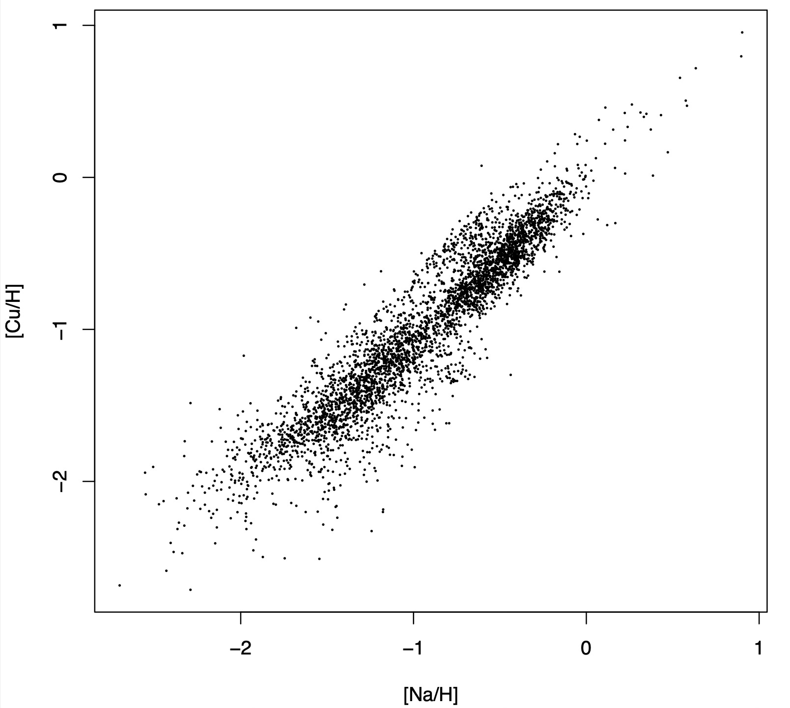
Scatter plots are the workhorse of exploratory data analysis (EDA). They are the first thing that springs to mind when we say that we want to take a look at the data with our own eyes. Looking at the scatter plot above, we learn immediately that sodium and copper abundances are correlated, that the relation seems linear, and that the scatter around it appears to decrease with increasing sodium abundance.
As useful as they are, scatter plots have two main shortcomings: the biggest one, that they only accommodate two variables at a time, and a secondary one, that they just show the association between the two variables that are being plotted, confounded as it may be by other variables. That is, the scatter plot above should not be interpreted to mean that adding sodium to a star causes its copper concentration to also increase.
Added variable plots
An attempt to address the latter shortcoming is the so-called added variable plot: instead of plotting Y against X, we plot the residuals of two regressions against each other. The first regression is Y ~ Zi, and the second one is X ~ Zi where Zi represents all confounding variables.
This introduces a host of new problems, though: first of all, historically, people were just throwing all variables besides X and Y into the Zi bucket, irrespective of whether they really were confounds or not. The very wikipedia page I just linked suggests doing this as of July 24, 2025! Here is the quote (boldface mine):
residuals from regressing Y (the response variable) against all the independent variables except Xi
Also, both regressions usually make restrictive assumptions such as linearity. As a result, the data is no longer speaking to us in its own words. We are imposing a model of how the data is generated, which takes us out of EDA territory. Whether this is a price worth paying depends on our goals for the analysis as well as on the nature of the dataset.
Here is what happens when I make an added variable plot for copper against sodium controlling for all the other abundances in the data set. That is I am predicting copper from iron, magnesium, zinc, etc... to the exclusion of sodium via linear regression and placing the residuals on the X axis, then doing the same for sodium, this time excluding copper from the predictors, and placing the residuals on the Y axis. The result is as follows:
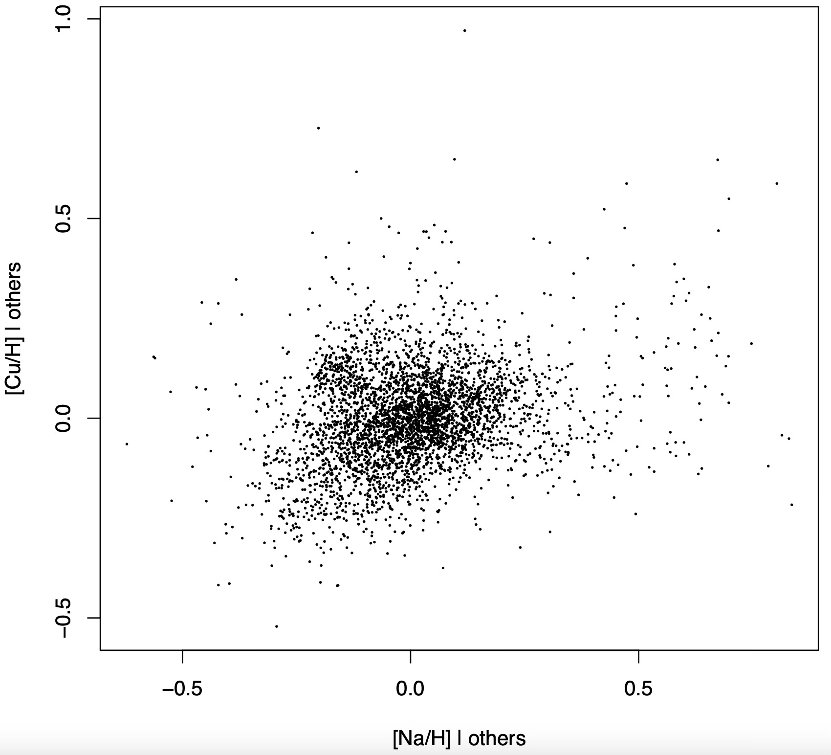
Should I trust this to reveal the real causal relation between sodium and copper? Intuitively, the logic behind added variable plots is that, once we control for every known source of variation -that is, the abundances of other elements- what is left is the genuine exogenous variation of copper, which we are plotting against that of sodium. While this sounds convincing, it is in general wrong.
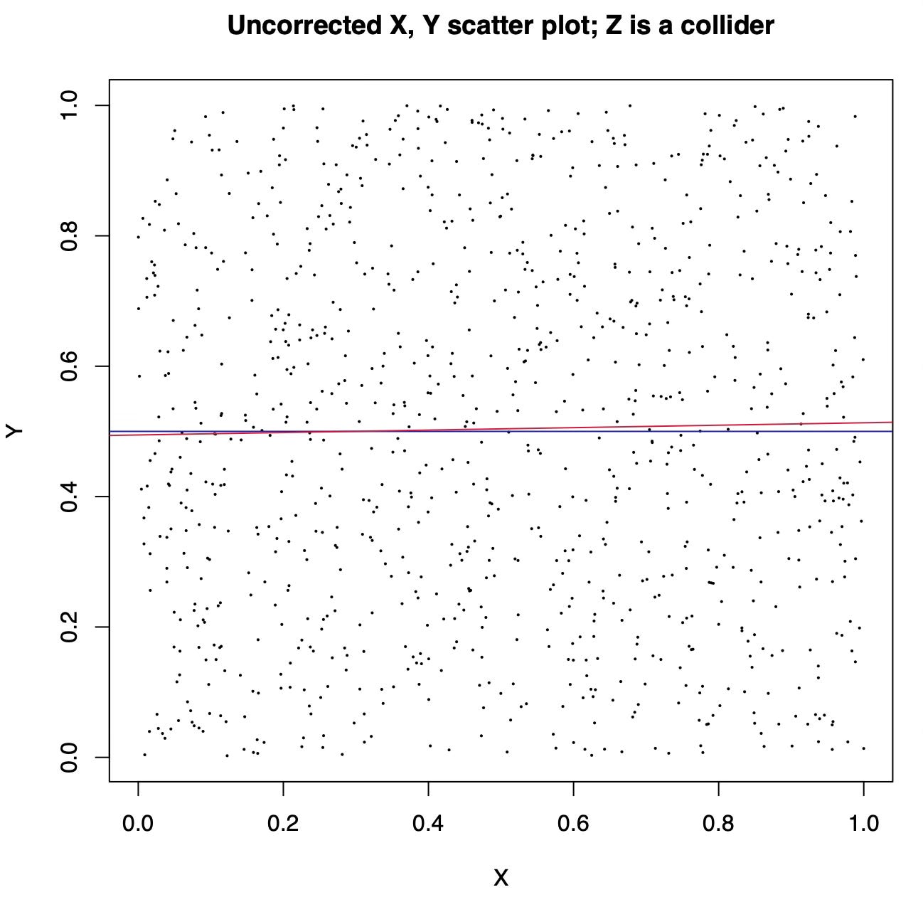
Here is what happens when both X and Y are synthetic variables generated by sampling uniform random numbers between 0 and 1 and Z is X + Y plus some noise. The unadjusted scatter plot of X and Y shows the real causal relation between them, which is non-existent: since both are sampled independently at random, changing X does not affect Y.
Here is the added variable plot:
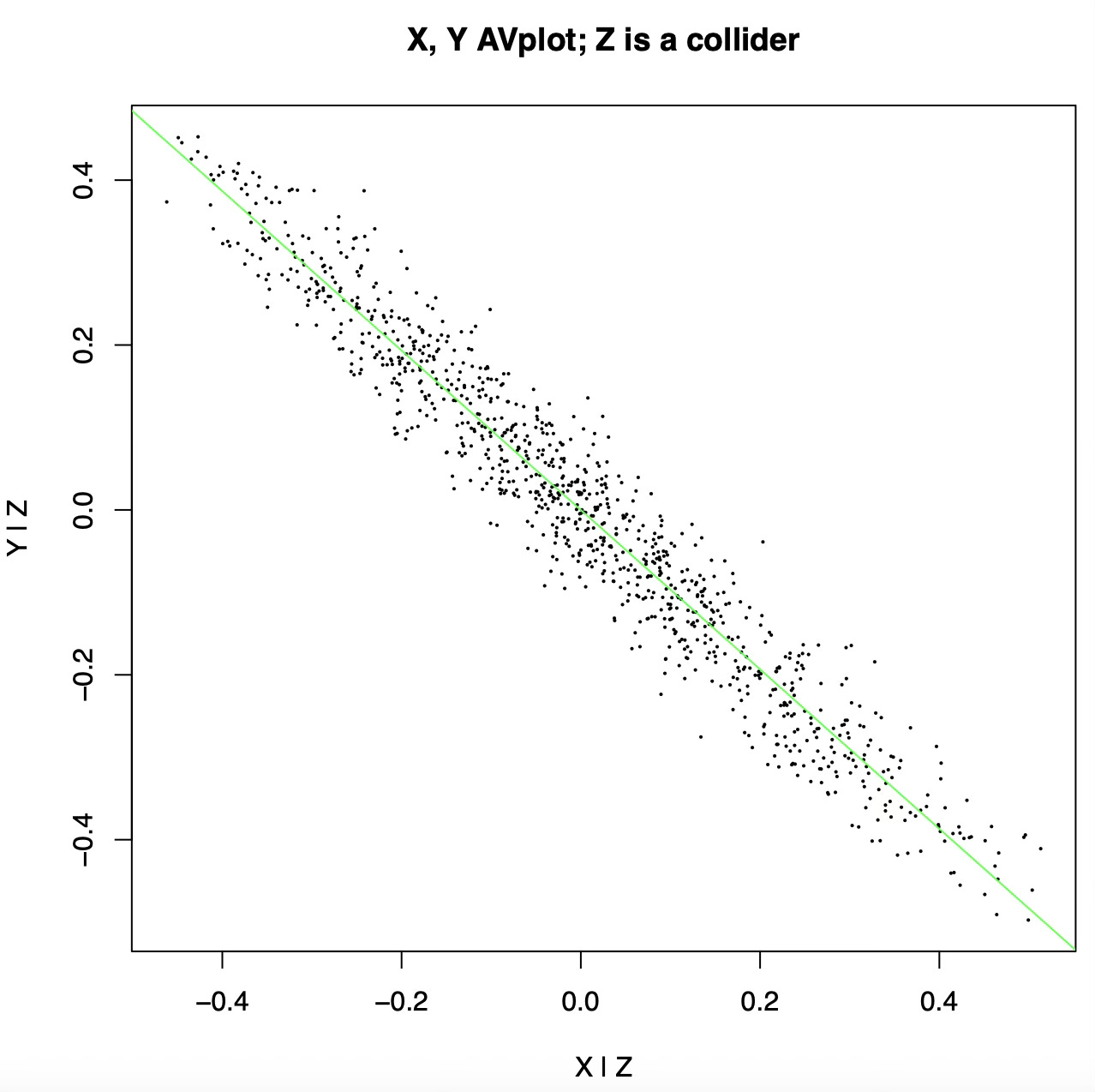
After controlling for Z we see a strong anticorrelation between X and Y! The added variable plot is basically lying to us, because we treated Z as a confound (a common cause) when in fact it is a collider (a common effect).
Unfortunately there is no general recipe to know whether a variable is a confound or a collider just by looking at the data1, so again if we want to choose the variables to control for when making an added variable plot we must leave the realm of pure EDA and make assumptions.
The n-dimensional eye
The second shortcoming of scatter plots is perhaps even harder to deal with, because humans are not good at seeing and reasoning in high dimension. It has been said that if we could look at our data in dimension N as if it were dimension 2 then we would need no machine learning: we could just trace classification boundaries by eye. Three-dimensional scatter plots are possible, but since we are mostly confined to two dimensional display devices such as screens or paper, scatter plots work best when we have two variables only: displaying a three dimensional scatter plot in two dimensions entails using a fixed viewpoint and may be misleading.
Planar scatter plots can be made to work with three, four or five variables by using symbol shape, size, and color together with X and Y position to represent the additional dimensions, but again this leads to a different treatment for variables that are potentially better held on the same footing. Radar plots are a way to treat all variables equally, but they become hard to read when we have more than a handful of variables. At the opposite end of the spectrum we have Chernoff faces, where each variable plays a different role in shaping some part of a stylized face. Unfortunately, neither approach will work for say, 22 variables.
Other approaches involve giving up on the ambition to represent all variables at once, focusing instead on projections. If we have a limited number of variables, we can arrange two-variable scatter plots in a matrix, obtaining a pair plot. This however becomes quickly hard to make sense of as the number of variables increases beyond, say, eight, and at any rate it is hard to grasp interactions involving more than a few variables at a time. Solutions that involve making the plot animated or interactive so that we can look at the data from different angles are computationally expensive and cannot be rendered on static media.
An obvious solution is dimension reduction, either linear with PCA or ICA, or with nonlinear methods such as t-SNE. I will not get into it here as it again is leaving the realm of EDA at least if your definition of EDA is “just looking at the data”, and also it does not always work as intended.
A different approach that was met with less interest and can ultimately count as abandoned, is turning a scatterplot matrix into a fixed number of diagnostic indicators (k per scatterplot) which can then be in turn plotted to identify interesting projections. This was pioneered by Tukey with scagnostics, but is far from popular today.
Parallel coordinates
Finally, and most importantly for this post, people have invented the parallel coordinate display. This is a parallel coordinate display of my elemental abundances:
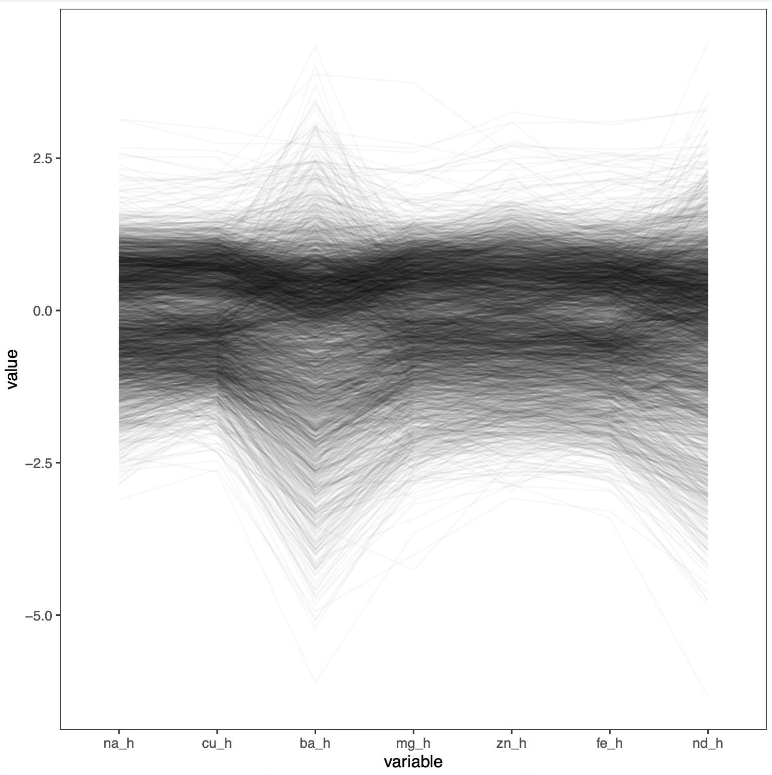
Here every data point (a star, in my case) is visualized as a broken line connecting the vertical lines representing the coordinates. These are typically rescaled so that they fall roughly in the same range and the resulting plot is readable.
The problem with parallel coordinate displays is that, again, they show the relation between pairs of variables only and, unlike scatter plot matrices, not even for all variables. The plot becomes more readable at the expense of hiding information. In fact, the order into which we arrange variables in a parallel coordinate display matters a lot, affecting what we can learn from the plot and the general impression we get, and is also arbitrary.
We can solve this by replacing the nodes in a DAG with coordinate axes and substituting parallel coordinate lines to each arrow of the DAG. The resulting plot should look as follows:
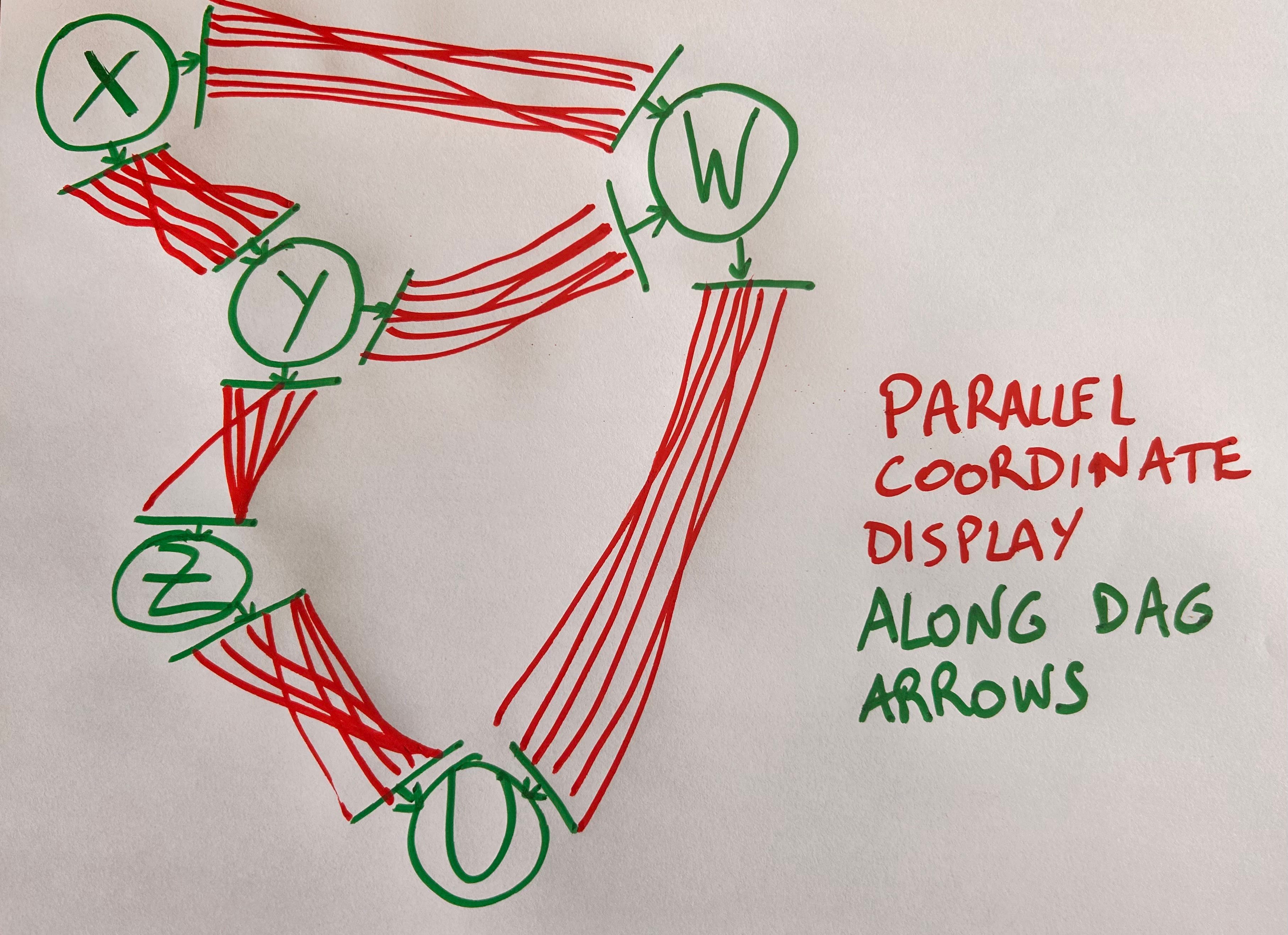
This beats other possible approaches, such as arranging variables at random or according to rules such as maximizing correlation, or making the plot interactive so the user can rearrange variables.
We can also run our parallel coordinate lines not from X to Y (for each couple of X, Y variables connected by a DAG arrow) but from the residuals of X ~ Z to those of Y ~ Z, as we would in an added variable plot2. Here Z are the confounds between X and Y, which are easily identified by the DAG itself. Alternatively we could just attach added variable plots to DAG edges, like this:
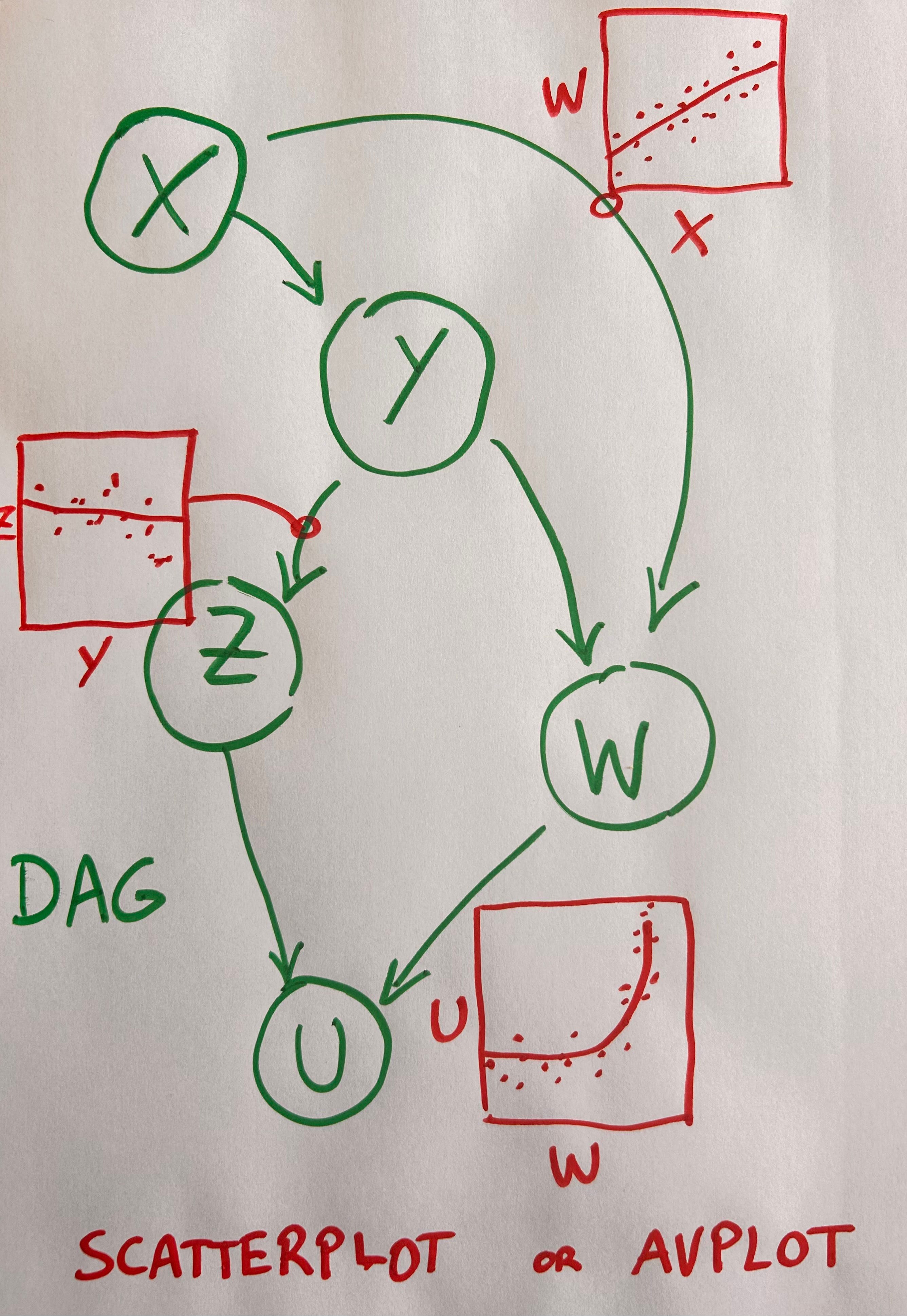
This design feels suboptimal in its use of space though: lots of blank space around the DAG arrows due to the fact that we can’t fit the scatter plots back to back seems wasteful. An alternative is to do away with the DAG altogether and adopt the convention that whatever is in the X axis is the cause, with effects in the Y axis:
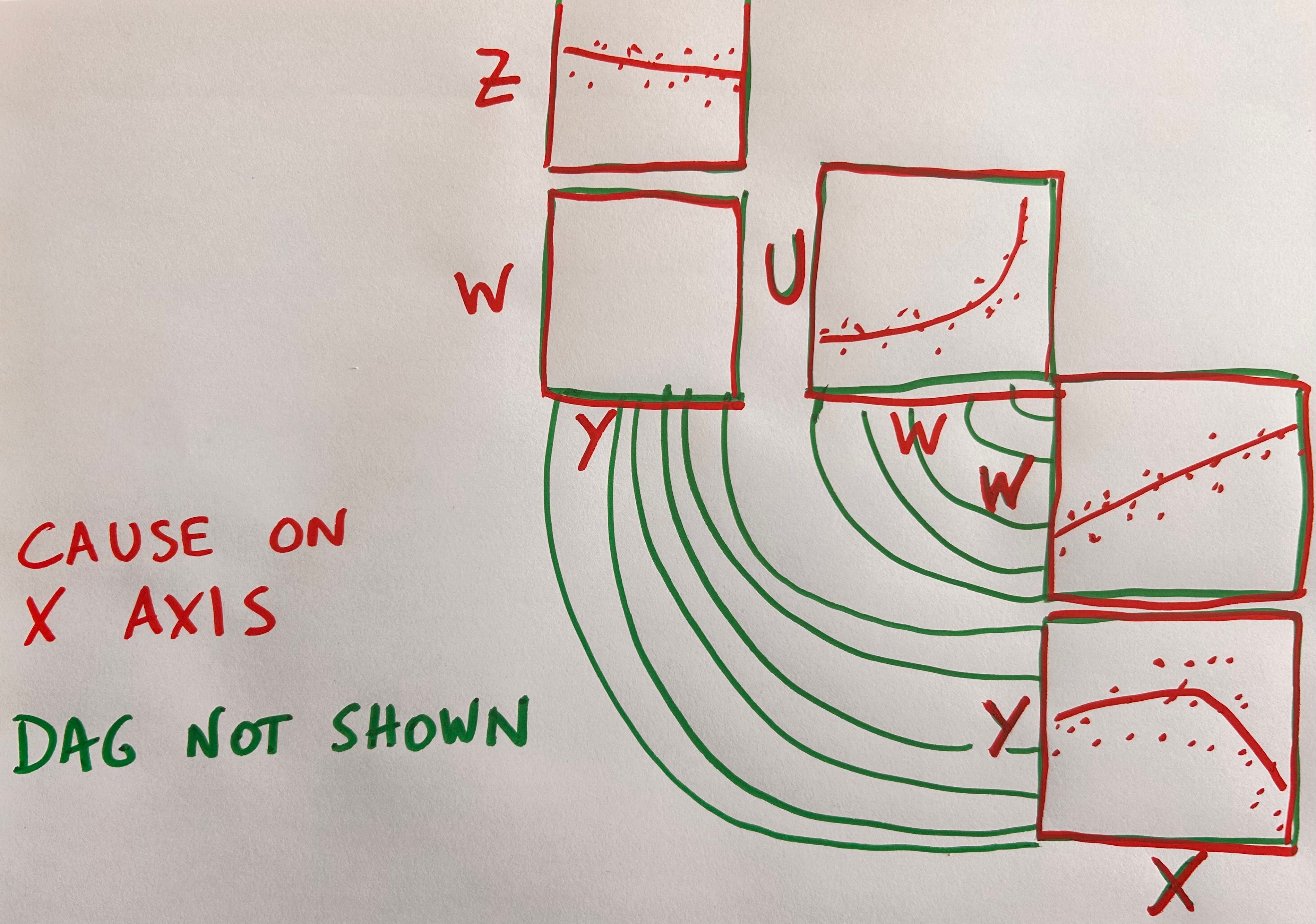
Unfortunately this forces us to repeat variable axes when their role changes from cause to effect.
Apparently there is no free lunch in causal data visualization.
Interestingly, reversing time turns common effects into common causes and vice-versa. The same data should be treated differently based on the assumed direction the data-generating process was running in.
Unfortunately this would negate one of the benefits of the parallel coordinate display, that is the ability to interpret a single line through the variable axes as a data point: line segments going from the X to the Y axis would meet the axis at Residuals(Y ~ Zi) where the choice of Zi depends on X, but they would then emerge from the Y axis towards, say, the W axis, at Residuals(Y ~ Z’i) where Z’i now depends on W. The parallel coordinate lines would become discontinuous. Another potential issue is that added variable plots made by controlling for confounds are not naturally associated to the edge between X and Y, because they would show the total effect of X on Y rather than the direct effect only. To get the direct effect we would have to control for all parents of Y except X, even if they are mediators between X and Y.
“Unfortunately there is no general recipe to know whether a variable is a confound or a collider just by looking at the data” This sentence seems to rule out causal discovery. Clearly that’s not what I meant. Causal discovery also rests on assumptions, and it’s certainly not possible to describe it as “just looking at the data”.