


X-ray transient classification for fun and profit
A case study on integrating machine learning into the workflow of astronomers, part one

There is a satellite called XMM-Newton orbiting the Earth on a high orbit, reaching its apogee at about one third of the Earth-Moon distance. In our break room at IASF we have a nice coffee table made with a repurposed prototype mirror from this satellite. The mirrors were made by an Italian company located not far from Milan, close to the nearby lake Lecco. It is a metal tube about a meter in diameter, made of an alloy I can stick a magnet to1, but coated internally in gold. The actual mirror has many of these tubes in different diameters arranged concentrically one inside the other.

X-rays tend to go right through stuff if the incidence angle is too close to normal, so the concentric tube mirror design aims for grazing incidence: rays coming in from the general direction the tubes are pointing at will bounce on the coated surfaces at a shallow angle. Grazing incidence makes it easier for light to bounce off a surface instead of penetrating it, a bit like the trick where you throw rocks almost parallel to the surface of a lake to make them bounce. You have probably noticed this with regular light: look at a surface by placing your eye almost level with it and it will behave like a decent mirror, easily revealing any otherwise invisible spots in the process.
There are three such mirror assemblies, each one focusing light onto its own detector. Only one camera is fully unobstructed: in the others, about half of the photons are redirected to a spectroscope and cannot be used for imaging. This is important, because data is subdivided into photon detections from each camera, and the cameras are not identical: this is a huge PITA if you want to put the data back together.
Enough with the hardware, but keep in mind that light can (and will) do weird stuff in this setup. Here is an example image of a field taken by the telescope:
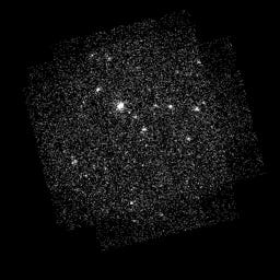
As you can see there are a bunch of dots that look like stars, over a background that looks like static. It is by now well known that stars emit in the X-ray band, so the dots that look like stars are probably stars.
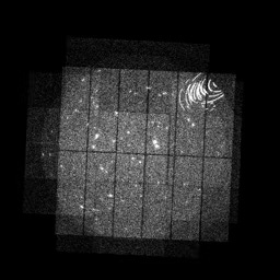
I don’t know much about the kind of preprocessing this picture underwent, nor which camera(s) took it and how the whole thing was stitched together. I was just given a few hundred of these by a colleague, because I am helping him weed out images that are broken due to a phenomenon called stray light annuli. This is a relatively simple supervised classification problem that a resnet-9 with frozen weights proved capable of handling. Here is a broken image, by the way:
Beautiful and annoying as these annular artifacts may be, the main focus of my current work is something else. The X-ray sky, unlike the optical sky we are used to, changes rapidly. X-rays are typically generated by violent, transient phenomena. Your dentist produces them by smashing energetic electrons into a dense metal, typically tungsten. Not too dissimilarly, stars use energetic particles and magnetic fields: we call these bursts of radiation stellar flares.
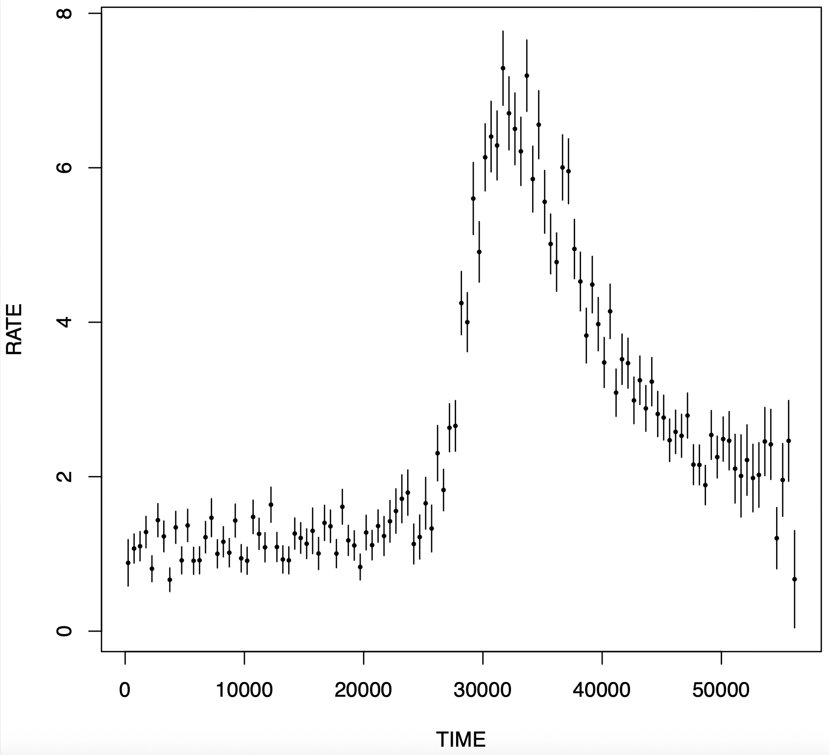
Here is a light curve with a flare. This shows the luminosity of the object as a function of time. For this source, it stays roughly constant (at least within the error bars, which account for photon counting statistics) up to ~30000 seconds into the observation, then rises suddenly, and finally decays slowly with a shape that looks exponential. This pattern is known as FRED, for Fast Rise, Exponential Decay. If this kind of pattern is indeed due to stellar activity, it is a commonplace occurrence and we don’t really care about it that much, though other astronomers who focus specifically on stars may. On the other hand, a flare that looks like this but does not come from a star may be something exotic, potentially worth looking at. More prosaically, it may be a paper.
Now, is this flare stellar? Well, they do not come with a label. The obvious way to check is to cross-match the flaring X-ray source with an optical catalog of stars, for instance from the Gaia mission. This is tedious, at least if done manually. It also depends on arbitrary choices as to what is considered a match: the angular position of the X-ray source is affected by an error that forces the matching to be fuzzy, so that there can be zero, one, or multiple matches based on how much wiggle room we allow in the celestial coordinates.
We are thus faced with a choice: either stick to phenomenological labels, i.e. “this looks like a flare to my trained judgment” or go for interpretive labels “this looks like a flare and I found an optical counterpart within 5 arcseconds of it, so it is stellar”. Both approaches have cons, as well as -hopefully- pros.
We2 recently got a paper accepted by A&A where we use machine learning to automatically tag flares. This is very useful, because there are about 800 thousand light curves (which you can imagine as plots like the picture above) and nowhere near enough man-hours to look at them by eye. In fact, only about 13 thousands were ever seen by human eyes.
While finding flares is a straightforward supervised learning task, the devil is in the details. We started working about two years ago with a phenomenological definition of flares and with about a hundred predefined features, precomputed for each light curve. The features are stuff like “the kurtosis of the flux values taken on by the light curve” or “the coefficient of a parabolic fit to the light curve”, etc. While these are clearly suboptimal in that they probably throw out valuable information, they are certainly interpretable. It is tempting to replace them with deep learning, but it is crucial not to lose too much interpretability in the process.
Needless to say, halfway through the project we changed our mind, and switched to the interpretive definition of flare. This does not change much the nature of the problem because most flares are stellar flares, but in my opinion it pollutes the labels: it is almost certain that some flares have a counterpart that was missed, and it is unrealistic to expect a classifier to be able to predict whether this was the case from the light curve alone. Unfortunately you sometimes have to stick with the suboptimal outcomes of a group decision making process.
To further illustrate the point that writing scripts for doing science is not the same as attempting to create a stable software product (the goal of most software developers), at some point we also changed the feature pool. As it turns out, some features like the total flux (the sum of all the light recorded in a light curve) do not just depend on the physics of the source itself, but on how far we are from it. Any light looks dimmer from afar, simply because its photons spread out on a sphere whose surface increases quadratically with distance. Since we want to uphold the illusion that there is a separate, external reality made up of discrete objects underlying experience, this was no good. We had to remove the features that depend on distance: fairness through unawareness, more on that later.
At that point I had retrained my XGBoost model a few times already. The final performance (on a fresh train/test split) is shown in the figure below, taken from the paper.
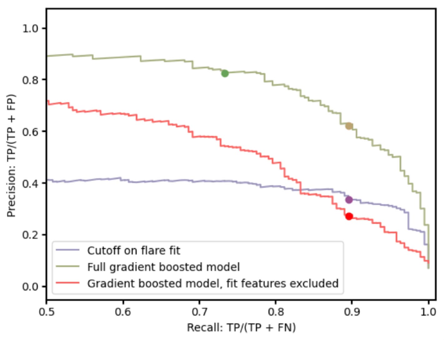
The green curve is the result of my work. The purple curve is the previous state of the art. Curves up and to the right are good. The green curve is much better than the purple curve because it sits much higher. Victory!
[To be continued, otherwise the post will be too long for email delivery]
Apparently it’s nickel
By which I mean my group at IASF