


X-ray transient classification for fun and profit
Part two of many: the making of light curves

So, to pick up where we left off yesterday, I have been working on supervised classification with the goal of finding flares in a sizable dataset of light curves from XMM-Newton. We can take several tangents from here, picking flowers in the garden of forking paths. Let’s start from the beginning.
Light curves: the good, the bad and the ugly
In the beginning there were photons. They had an arrival time, an X and Y position on the detector, and an energy. Photons can be aggregated into an image, if you bin them in X and Y, and similarly into a light curve if you bin them in time. My colleague Martino did that. Then he looked upon the image and the light curve and he saw that they were good.
Just kidding: as we saw yesterday, images are far from perfect. Similarly, light curves contain a bunch of artifacts. For one thing, charged particles can scatter through the tube mirrors pretty much like X-ray photons do, and they also make the detectors light up. The resulting background noise depends on the satellite position along its orbit, which crosses the Van Allen belts. While the instruments shut off inside the belts, soft protons show up in bunches also elsewhere. We do not have a perfect model of these spurious events, so they cannot be fully subtracted off.
So our light curves, on top of having different durations, often have periods where no photons were observed because the camera was off. These holes of course vary in duration. The curves also have weird artifacts from incorrect background subtraction, so that at times the nominal flux is negative! On top of this, the three cameras (which, remember, had different sensitivities) sometimes are not all on at the same time. I don’t really know why, but this tends to happen mostly at the beginning and at the end of observations. This means that part of a light curve may be made up of the average of photon counts from two cameras only. This leads to poorer statistics and larger error bars.
Binning
Binning data is bad in the sense that arbitrary stuff is bad. Binning introduces at least two arbitrary quantities, at least if we stick to uniform size bins: the starting point, and the size of the bin. The starting point is arbitrary even if we start at the beginning of the observation: if the observation is serendipitous, that is we had no particular reason to point a certain object at a given time, then the time at which the observation begins is itself arbitrary with respect to the source’s dynamics. Usually at least a handful of sources is present in any given observation, so even if one of them was observed on purpose, the others were not.
Arbitrary as it may be, the choice of a starting point is not that consequential. The size of the bin on the other hand makes a huge difference. There is a bias-variance tradeoff: smaller bins may reveal more structure but may produce a noisy light curve, while larger bins err in the opposite direction by suppressing both noise and genuine structure.
Still, arbitrary stuff sometimes is either necessary, or not that bad. Language, speed limits, mains voltage and frequency, compute thresholds for AI reporting: all of these are arbitrary and they also all (kinda) work.
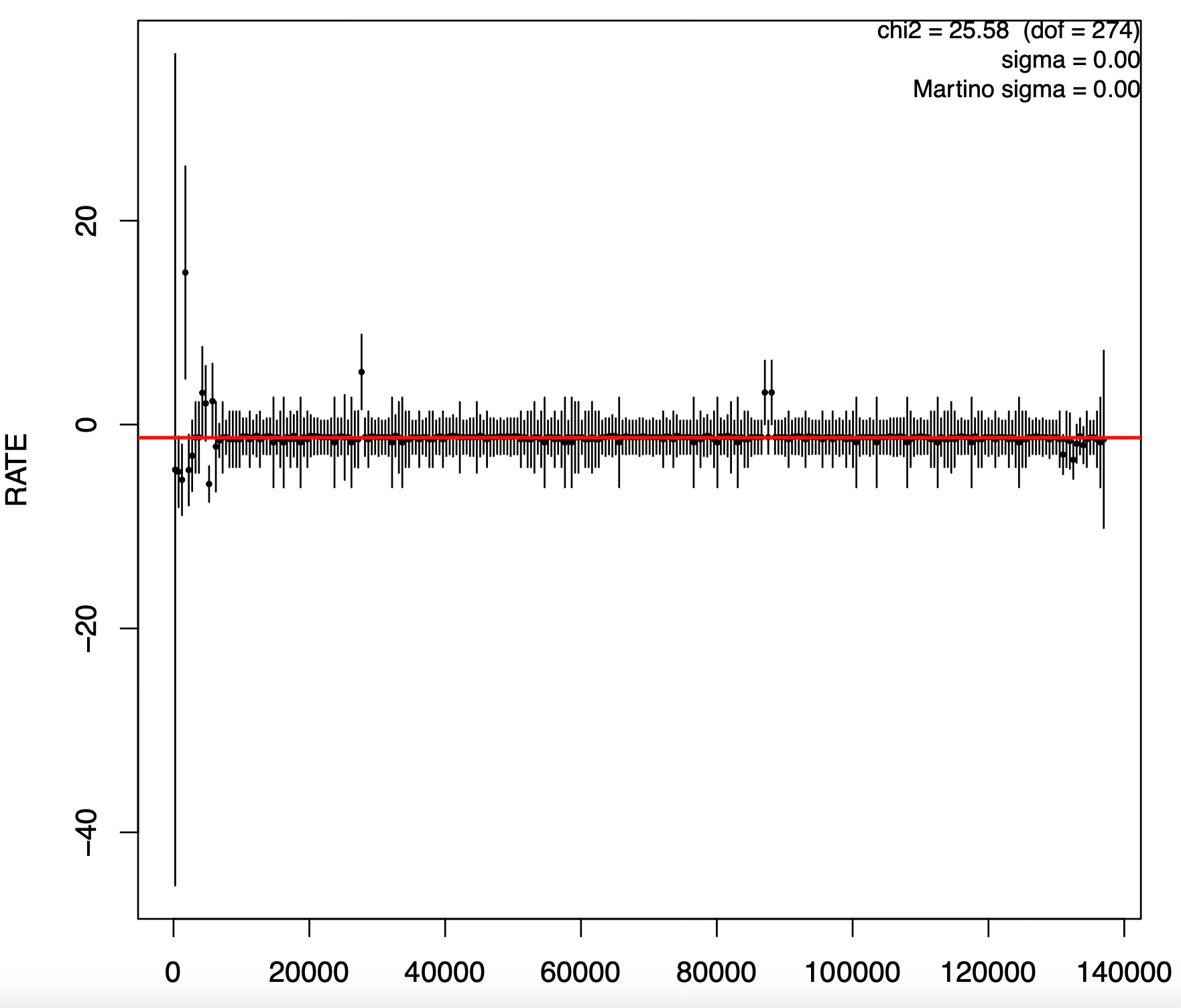
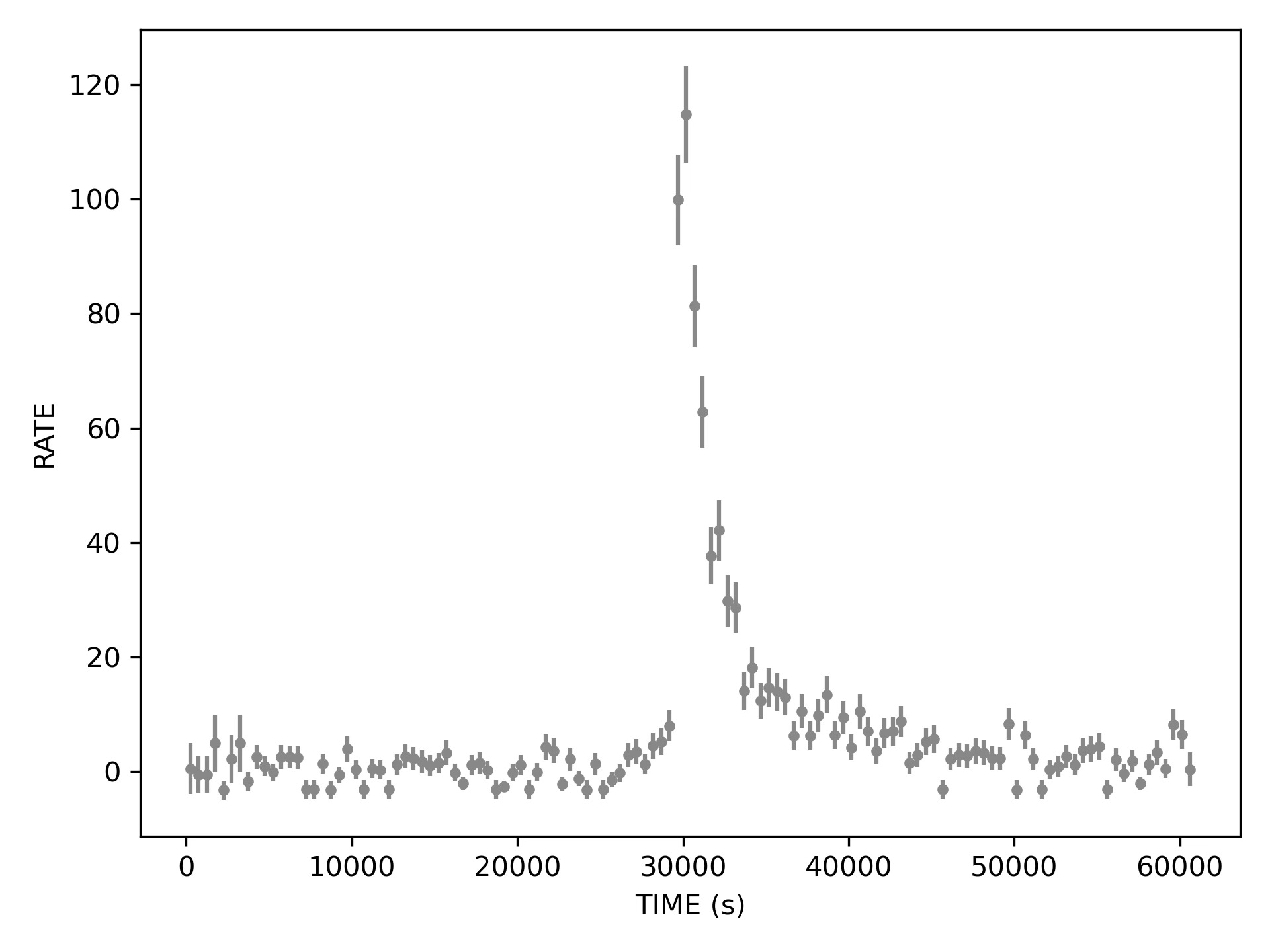
So of course we are binning our photons to get a light curve. Originally the bin sizes for which curves had been computed were 10, 100, 200, 500, and 1000 seconds1. I picked 500s to start from somewhere, but perhaps it is instructive to show a light curve obtained at different bin sizes.
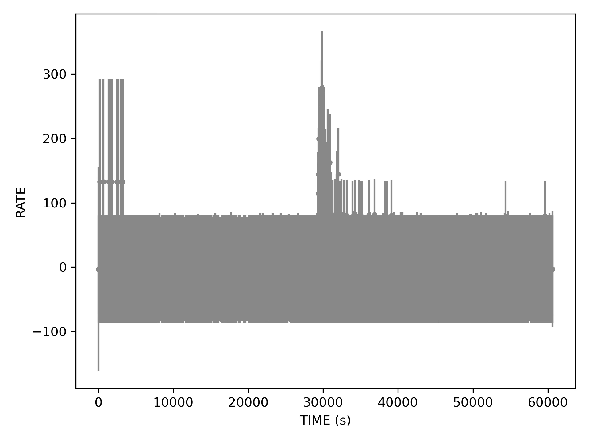
At 10 second bin size, most bins look empty. Without additional effort (that I do not want to expend now) the plot is almost unreadable due to data point overlap. Clearly the error bars become questionable: while it is reasonable to have an uncertainty on the photon count in a bin with zero photons, symmetric error bars wrongly imply that counts could have been negative.
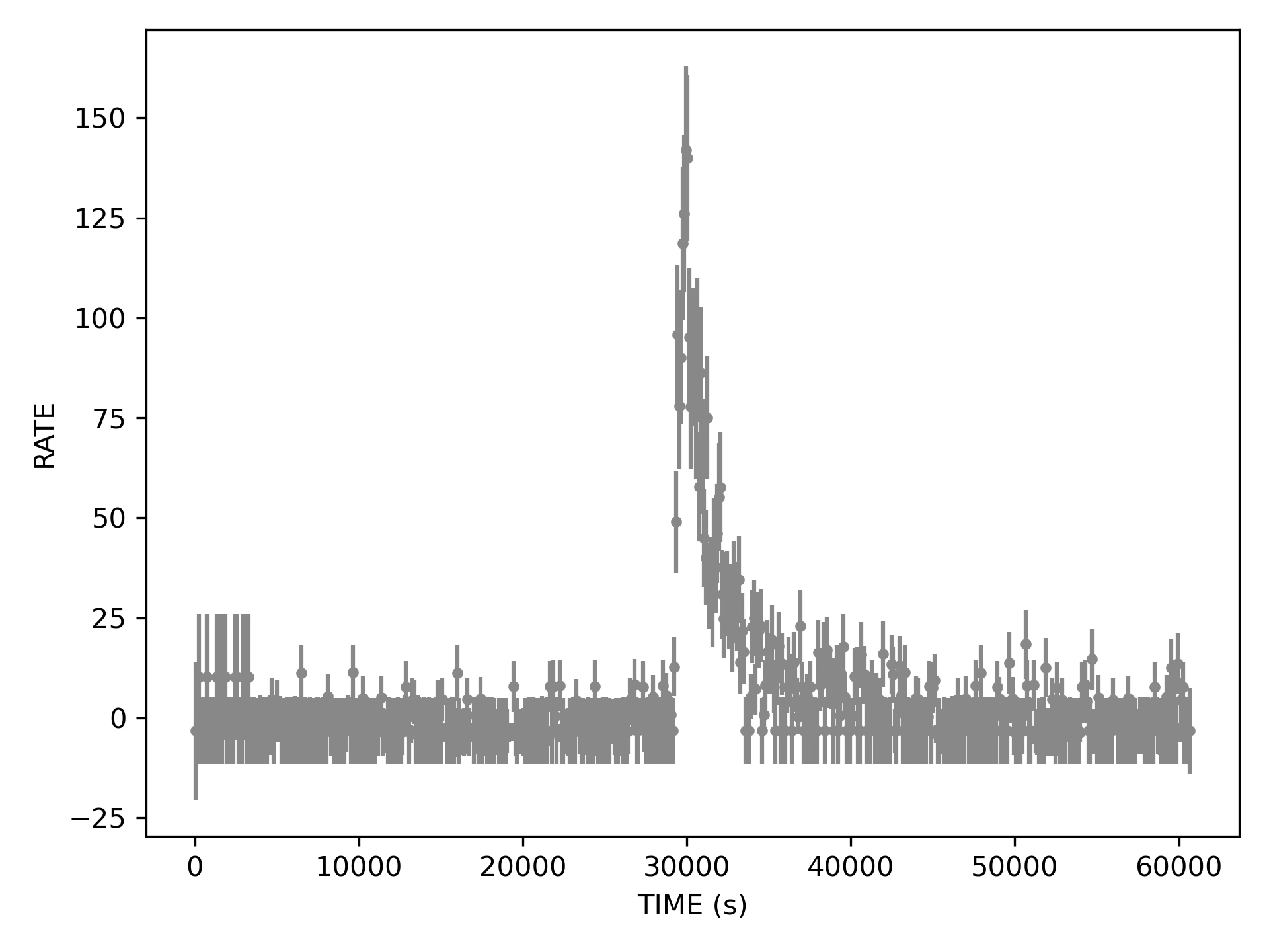
100 second bins already look better. There is clearly something that resembles a flare in here. Also some mess at the beginning of the curve.
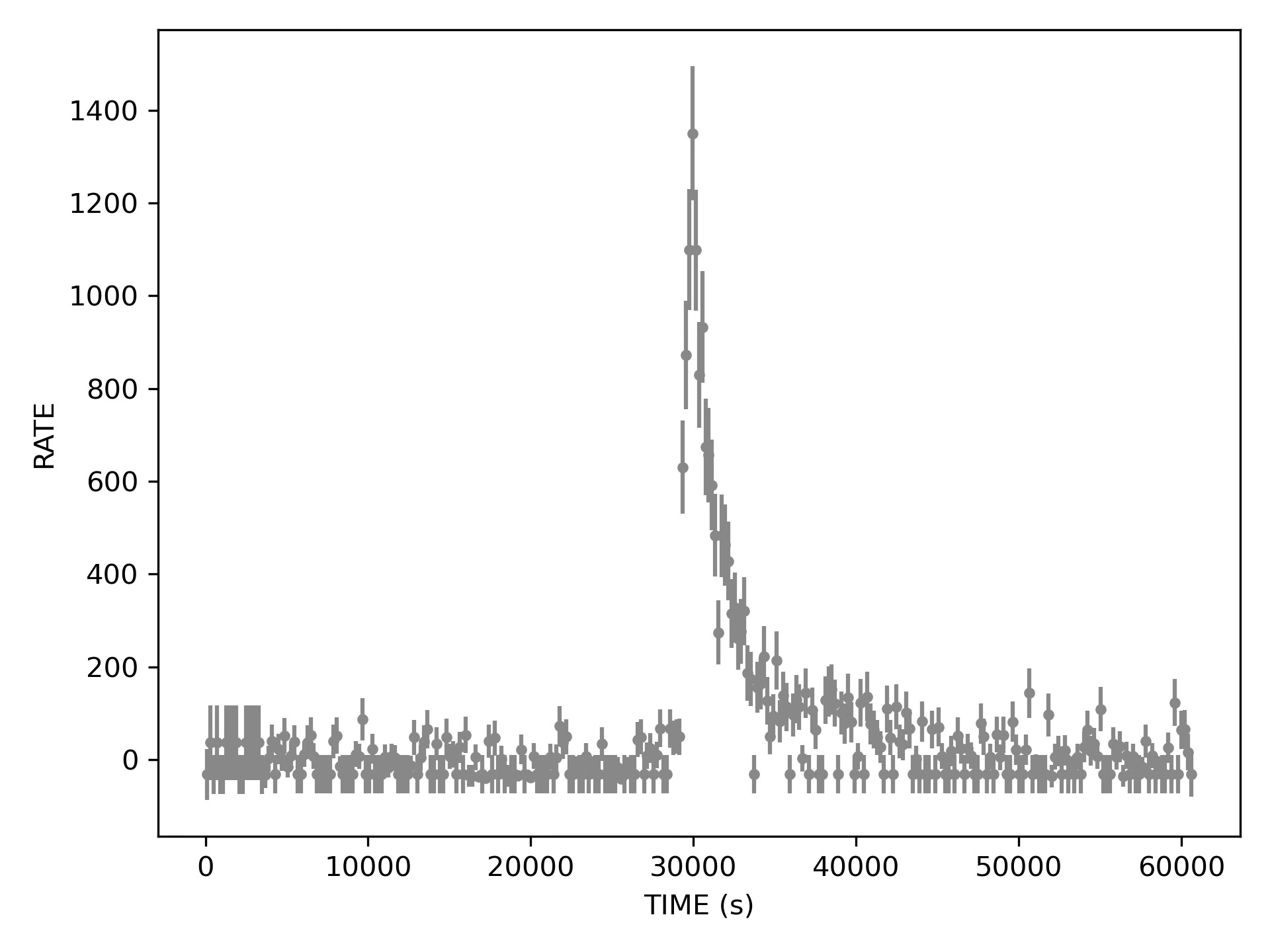
Both 200 and 500 second bins look decent, the first choice perhaps produces still too many bins with no photons. Now the flare is clearly visible in its full FRED glory. Also if we squint we may see some aftershocks at about 50000 and 60000, but are those real?
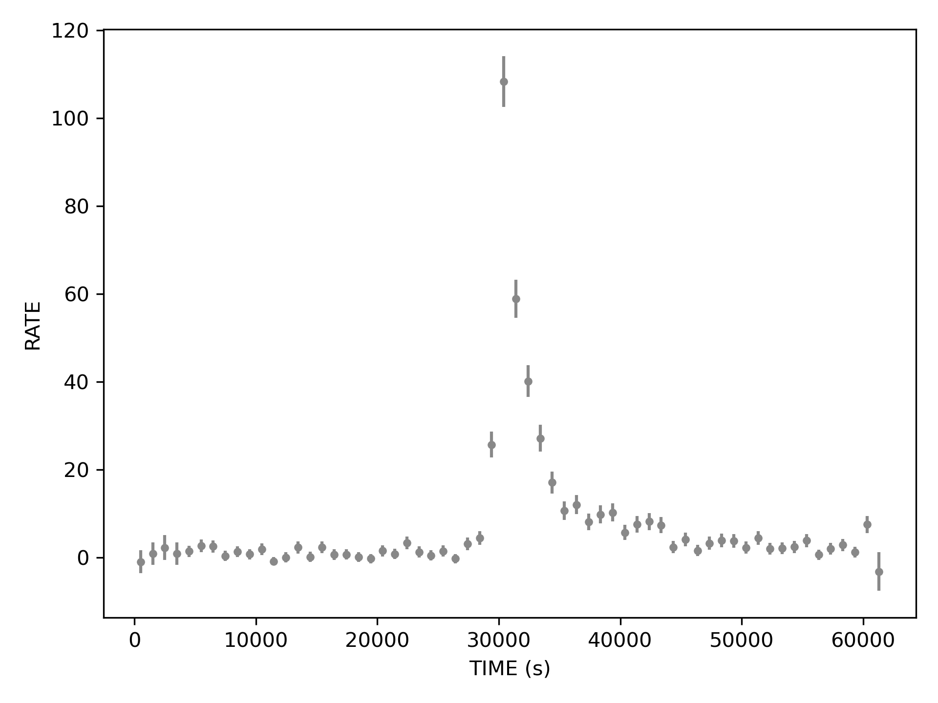
Now the error bars look tiny, the mess at the beginning is conveniently swept under the carpet averaged out, but the aftershocks disappeared and the rise does not seem that fast anymore, looking almost symmetric to the decay.
Let’s stop here for now. The next post will cover how we featurized these curves and how we plan to do that even better with deep learning.
[to be continued]
To be fair to those who worked on this data before me, the shortcomings of uniform binning were clear early on. Adaptive binning was also considered. Bayesian blocks were computed independently for each camera, yielding three adaptively binned light curves. I will get to that at some point.